
Events
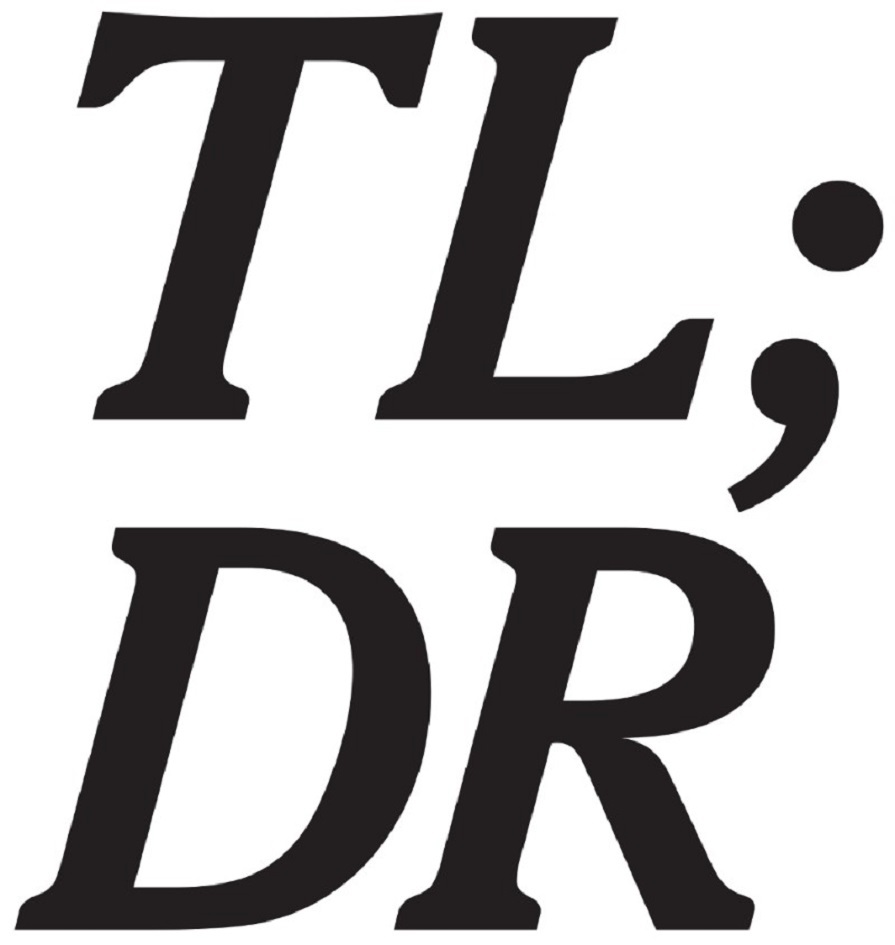
Ron Terada | TL:DR
Join the Catriona Jeffries Gallery for this solo exhibition by 1991 alumnus Ron Terada.
Opening Reception | Thursday, September 14, 6–9pm
Catriona Jeffries Gallery
You enter and see the back of an unfinished wall. Shining steel studs
are exposed, electrical connections, cables snaking down, around,
plugged into a wall socket near the door, a scattered constellation of
mounting hardware on the back of the drywall. You could presume that
there is an artwork on the other side of the wall and you are seeing the
back of it. Or not. This scenario of exposed drywall and steel is
likely not an unfamiliar contemporary art experience for you.
You turn right. Your view of a large group of text paintings on the far
wall is partial. There are four sizes of paintings but they form one
unit together, puzzled together perfectly, and you can read a number of
them from where you are. Clean black text on white, the canvases butted
tightly together form a large band almost eight feet tall that runs
beyond your vision, blocked by the newly constructed wall. The light in
the space beyond you seems much brighter and of a different colour
temperature.
You may have read that the TL; DR painting series is Ron’s most
recent work and that the texts themselves are found. They are short
headlines taken verbatim from a single website, The Verge, and their
font is Cheltenham, the typeface used variously by The New York Times
for their print edition headlines, as the outdoor outfitter L.L.Bean’s
logo, and for any bill in the United States Congress. The Verge does not
use this font, their font is terrible.
According to The Verge itself, it “is an ambitious multimedia effort
founded in 2011 to examine how technology will change life in the future
for a massive mainstream audience. Our original editorial insight was
that technology had migrated from the far fringes of the culture to the
absolute center as mobile technology created a new generation of digital
consumers. Now, we live in a dazzling world of screens that has ushered
in revolutions in media, transportation, and science. The future is
arriving faster than ever.”
You may or may not know that Ron has been producing series of found text
paintings since 1993. Their sources include commercial gallery ads,
high school yearbook quotes, Jeopardy clues, bibliographic citations
from a book about art world finance and the full text of an artist’s
memoir. These new paintings in front of you might seem familiar—their
texts are not precisely click bait, not quite Buzzfeed, Upworthy, or
Breitbart—but their headlines dabble in that logic, clearly functioning
under a capital of clicks. This form of communication is known and it is
dense with potential, producing texts that are simultaneously earnest,
self-satirical, frightening, meaningless, and absurd.
You read that the painting’s titles are also the texts of the works,
followed by the date, hour and minute they were originally posted
online. The fleeting nature of their relevance, logic or lack thereof,
is fixed in front of you as paint on canvas. The temporal nature of
contemporary art production and its currency, with cruel tides of
attention and success, may or may not enter your thoughts.
Familiar corporations and business leaders feature in the majority of
these paintings’ texts, and you may note that some measure of absurdity
comes from the recurrent obsession with the detailed nuance of
socio-technological progress in concert with the socio-cultural
sublimation of “corporate personhood”. (If you search this term on the
internet you will probably find that this is the legal notion that a
corporation has rights “separately from its associated human beings
(like owners, managers, or employees), and has at least some of the
legal rights and responsibilities enjoyed by natural persons (physical
humans)”. Further reading likely would reveal that most scholars agree
that this concept and law is a problem for the majority of the world’s
population.) You may find that a company’s status
update-as-news-as-advertising is much more engaging and relevant to your
life than many other things.
As you round the corner, you may continue reading these paintings, or
turn around to face the source of the light you noticed earlier.
Brightly lit white letters with brushed steel sides protrude from the
wall, “BEING THERE” writ large in a playful font. You may know the 1979
film of the same title starring Peter Sellers as Chauncey Gardiner, an
illiterate gardener who has spent his entire life within the walls of a
small estate, only knowing the world outside as mediated through
television. It is a clumsy but heady Hollywood film about the nature of
reality, which includes a scene wherein Chauncey attempts to use his
remote control to change the channel while he is being mugged. His
character goes on to win influence and power as his naiveté (Chauncey
uses words that are both universal and meaningless) passes for fresh,
profound wisdom. This concept may or may not feel relevant to you in
this particular moment in Western history, or you may just think of
being somewhere else. It is possible you are not aware that the
commercially-produced sign is from 2011 and was made for a different
context and city altogether, and you may think that it is current rather
than prescient now.
While you are looking at the sign, you see that the drywall stops to
your right but the steel studs of the wall continue on, revealing the
room behind but blocking easy passage. One last sheet of drywall would
easily seal the room. Moving towards this entrance, you can choose to
squeeze through the 16-inch space between studs to enter the space or
just peer past them. Inside you can see behind the wall to your
immediate left, revealing the mounting and electrical cables of Being There,
but on the far wall is another sign that you struggle to make legible,
the text is backlit, and the font is angular and strange. You might
decode it correctly as “WE WILL NOT GROW OLD TOGETHER”. You find out
that the typeface is designer Wim Crouwel’s 1967 New Alphabet,
“a personal, experimental project of Crouwel. “The typeface was designed
to embrace the limitations of the cathode ray tube technology used by
early data display screens and phototypesetting equipment, and thus only
contains horizontal and vertical strokes… Some of the glyphs are
unconventional, while others bear virtually no resemblance to any
version of the letters they represent (in some egregious examples, the
frequently appearing a glyph looks like a J, K looks like a t, numeral 1
resembles a 7, numeral 8 resembles capital H, and the x glyph looks
like a capital I). Because of this, the typeface was received with mixed
feelings by his peers.”
In your periphery you see a series of wood-framed black and white
posters. Each poster has a unique large black form printed over its
original design. The image underneath the obscuring form is an older
model Apple Powerbook computer with a psychedelic screensaver and pair
of headphones in front. You might recognize the underlying posters as
being one of Ron’s exhibition contributions in which he designs the
promotional poster for said exhibition, in this case a solo show from
2002, and may wonder if that old Apple laptop is now a collectible worth
some money.
You read that the forms that the artist has just recently printed over
these 15-year-old posters are decommissioned corporate logos, some
familiar perhaps, but most are likely not. These are smooth geometries
that are attractive, interchangeable and strangely uniform in their
design, communicating little about their respective organizations, like
the grocery chain Loblaws or the Canadian National Bank. They are all
generally representative of a particular techno-utopian futurism of the
1960s. You may or may not prefer these companies’ older identities to
their current logo designs, and also might wonder what the artist and
the public thinks of his older work compared to his new work.
You either squeeze back through the studs, or lean back into the main
gallery space, perhaps considering what it would be like if the wall was
just drywalled over, what the accessibility issues and fire regulations
are for an institutional gesture like this. Where you go from here is
undetermined but nonetheless predictable. You may walk further into the
gallery space to find a gallery guide, speak to a staff member, use the
washroom or retrace your steps back towards the exit. Or you may check
your phone for some new information.
Let me Google that for you.
TL; DR, short for “too long; didn’t read”, is Internet slang to say that
a text being replied to has been ignored because of its length. It is
also used as a signifier for a summary of an online post or news
article.