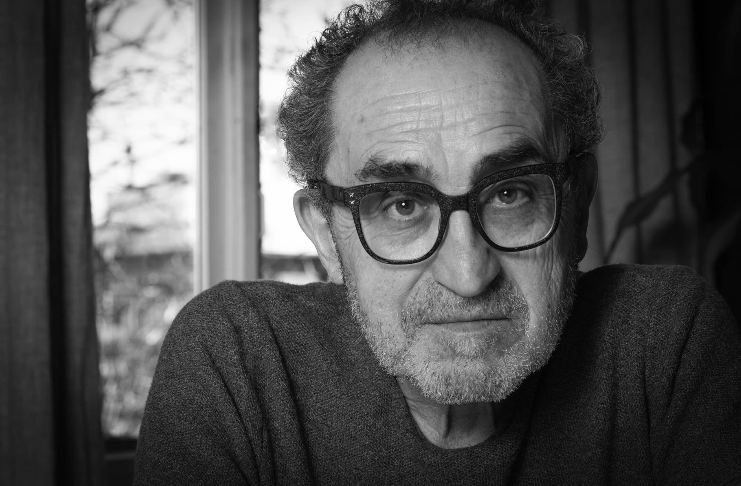
For the award-winning curator and 2026 ECU Honorary Degree recipient, Glenn Alteen, working with Indigenous and BIPOC communities was crucial in uplifting emerging artists at grunt gallery.
When Glenn Alteen co-founded grunt gallery, he had an unofficial mandate in mind when selecting artists to showcase: “If we don’t show this, will somebody else show it?”
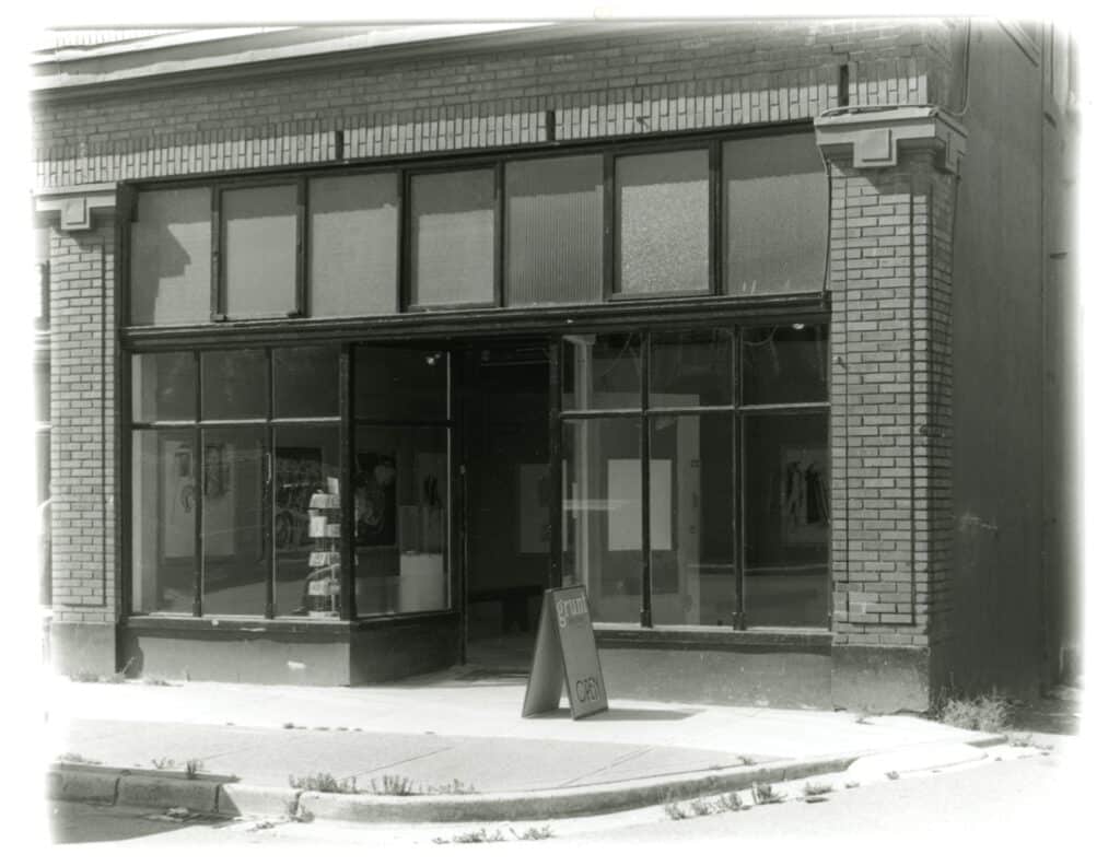
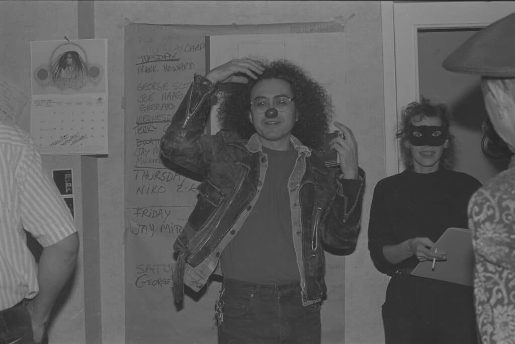
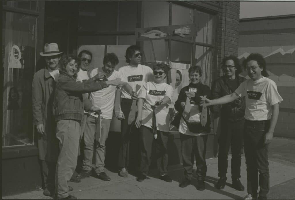
In his youth, Glenn gravitated towards literature in university, then theatre, before finding solace in visual arts through the vibrant shows and exhibitions around Vancouver in the late 70s and 80s. Once he graduated, he teamed up with fellow artists to open grunt gallery in 1984 where they could host the exhibitions and performances they felt were missing from the Vancouver scene and to compensate for their labour and efforts.
“[We] were trying to make sure that we could keep going and that we could provide opportunities for [artists], hire artists and pay artists. That part of it was always important, whether it was working with First Nations artists, BIPOC artists, and different kinds of communities.”
One of Glenn’s key projects was his collaboration with Lawrence Paul Yuxweluptun for An Indian Act Shooting the Indian Act where Lawrence shot copies of the document and worked with Glenn to stage an exhibition. The final piece is now at the National Gallery and is a powerful symbol of colonial rage and strife.
Along with supporting emerging artists, Glenn is committed to saving artist-run spaces amid constant city redevelopment and the financial pressures of operating within Vancouver.
When artists Carole Itter and Al Neil were facing eviction at the Blue Cabin, Glenn and Esther Rausenberg of Creative Cultural Collaborations (C3) and Barbara Cole of Other Sights for Artists’ Projects stepped in to save the cabin and turn it into a protected site for repair and remediation. Moments like these enliven Glenn to rise to challenges and shepherd artist-run venues for the next generation.
“We ran the thing to remediate, raise the money and build the cabin. I like to get into projects where I really don’t know what I’m doing. There’s something about being in [places] where you were really out of your league, where you really keep you on your toes, and that always makes it interesting for me.”
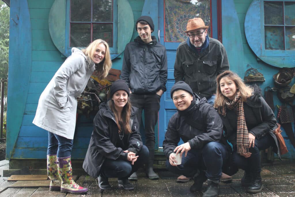
The Blue Cabin residency has been restored and is now docked at Heritage Harbour, where resident artists are encouraged to interact with the local arts community, develop their craft and present their work in dialogue with the environment.
For Glenn, paying it forward to help fellow artists from losing their spaces or supporting local curators is a core ethos of grunt’s work in the local art scene. For Glenn, it means taking up space and stepping up to help the next generation.
“There’s been a lot of trying to push into areas where, nobody else tries. We decided early on that we would do a lot more to support curators. We mentored a lot of curators over the years, and those people have moved out in the world and done amazing things.”