Reyhan Yazdani Builds Bridges Across Cultures with ‘Bi-scriptural Typography’
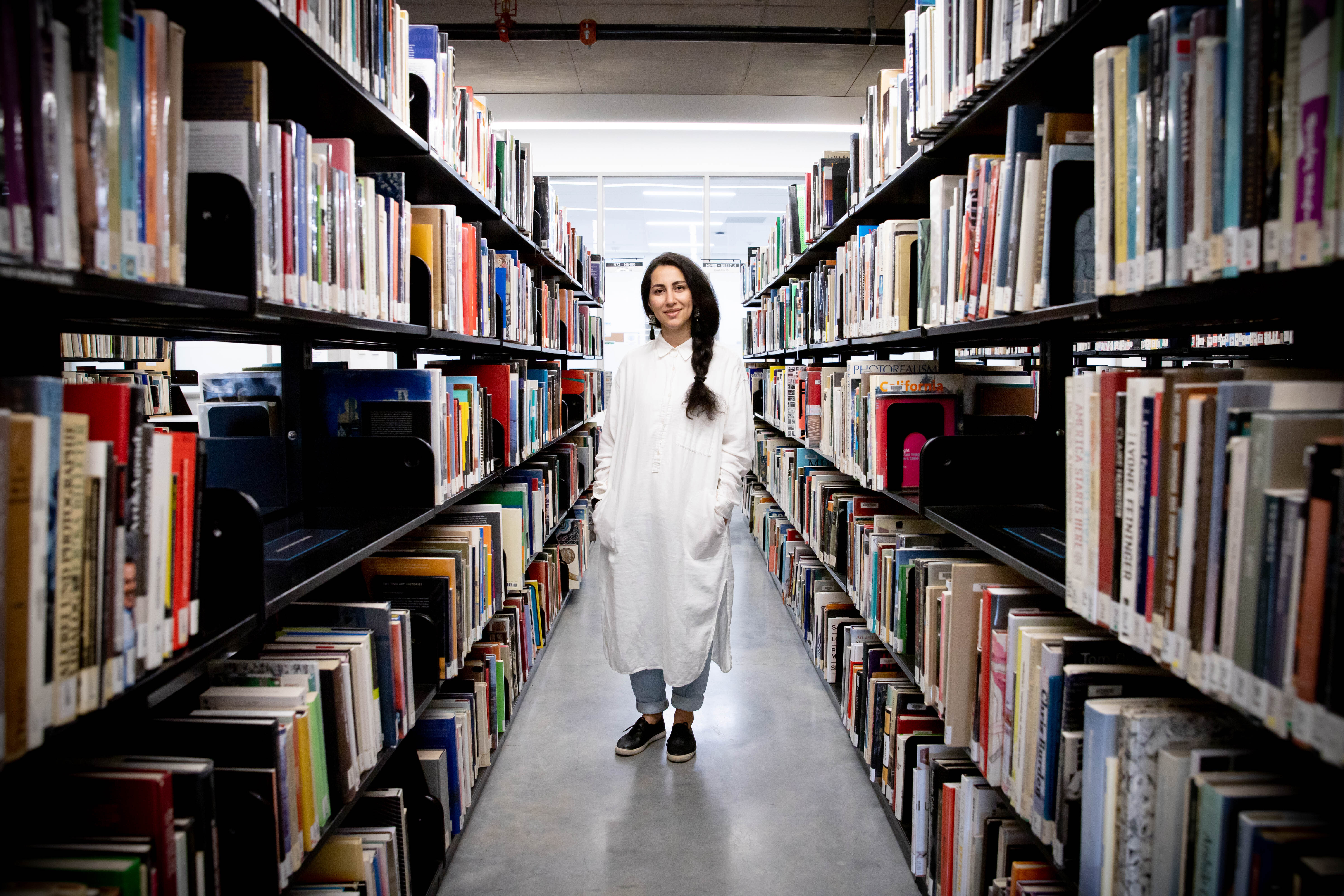
Artist, designer and educator Reyhan Yazdani in the ECU Library stacks in November, 2021. (Photo by Perrin Grauer / Emily Carr University)
Posted on | Updated
The artist, designer and ECU faculty member approaches the ‘continuous work of decolonization through the lens of language.’
It all started with an assumption, Reyhan Yazdani (MFA 2019) tells me. It’s an assumption anyone might have: that in any group, a shared language is needed in order to talk about languages that are not shared between members of that group.
“We were like, ‘What if we challenged that assumption?’” Reyhan, an artist, designer and ECU faculty member, says. “‘What if we try designing across languages without relying on a common language? What happens when we open space for non-Latin languages in our work and our conversations? What if we work on things that are untranslatable? How might that shift our understanding of design? How can visuals — how can typography — do the work for us when the words cannot?’”
These questions became the foundation for Reyhan’s Summer 2021 communication design course, Bi-scriptural Typography. Bi-scriptural typography can broadly be defined as working simultaneously with two or more script systems from different languages. In practice, this means discarding the notion that English — or any other language — needs to be the default language of design.
But this is no simple task, Reyhan says, especially in typography, where language is the subject of the practice itself. Overturning this fundamental assumption would require that students be open to a process of “unlearning,” she adds.
“The challenge is that bringing in another language means we are opening up the conversation to a different culture, a different mindset, a different paradigm. And that’s complicated,” she tells me. “But that curiosity, that unknown, that state of not knowing how to do it was the tone we set at the beginning of the semester. We were like, ‘Yes, this is a complicated process, but we should commit to it.’”
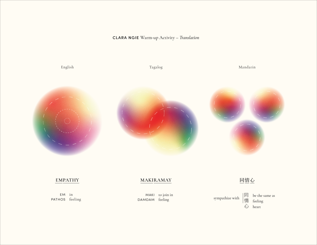
An exercise on “translation” by design student Clara Ngie from her coursework for Reyhan Yazdani's bi-scriptural typography class. (Photo courtesy Clara Ngie)
Having first arisen in an earlier course called Language, Politics and the City, taught by Reyhan at ECU, this commitment animated Reyhan’s practice as an MFA student at ECU, as well as her practice as an educator ever since. It informs her current Faculty Teaching Fellowship, run through the Teaching and Learning Centre at Emily Carr, through which Reyhan approaches the “continuous work” of decolonization “through the lens of language.” And it motivated her invitations to Paris-based designer Montasser Drissi and Vancouver-based designer, illustrator and ECU faculty member Daniel Drennan ElAwar to deliver talks to the ECU community over the summer on the subject of bi-scriptural typography.
The way this commitment plays out in the classroom can be messy, Reyhan adds. But by no means is the work impossible. Starting by acknowledging the messiness of the work is key, she says.
Also key is a conversation she has with her students early on around the subject of collaboration. That conversation explores what she considers to be foundational questions for the practice of working across languages, including, what are the possibilities a designer faces when working in an unfamiliar language? And what are the challenges? What is the role of collaboration in this process? And what does collaboration with a native speaker look like? What questions are acceptable to ask of a native speaker, and which are not?
Because Reyhan’s students spoke several different languages — including some who only spoke English — her classroom was an ideal place to work these questions out. She formed her cohort into small groups, with an eye to ensuring each group would have at least one member who was a fluent reader, writer and speaker of a language other than English.
“There’s this idea about shared knowledge, and about reciprocity and exchange; about coming together to help each other learn. That definitely was the anchor point in those groups,” Reyhan says.
“By emphasizing trust as a condition of this exchange, we started learning about bridges we could build as designers.”
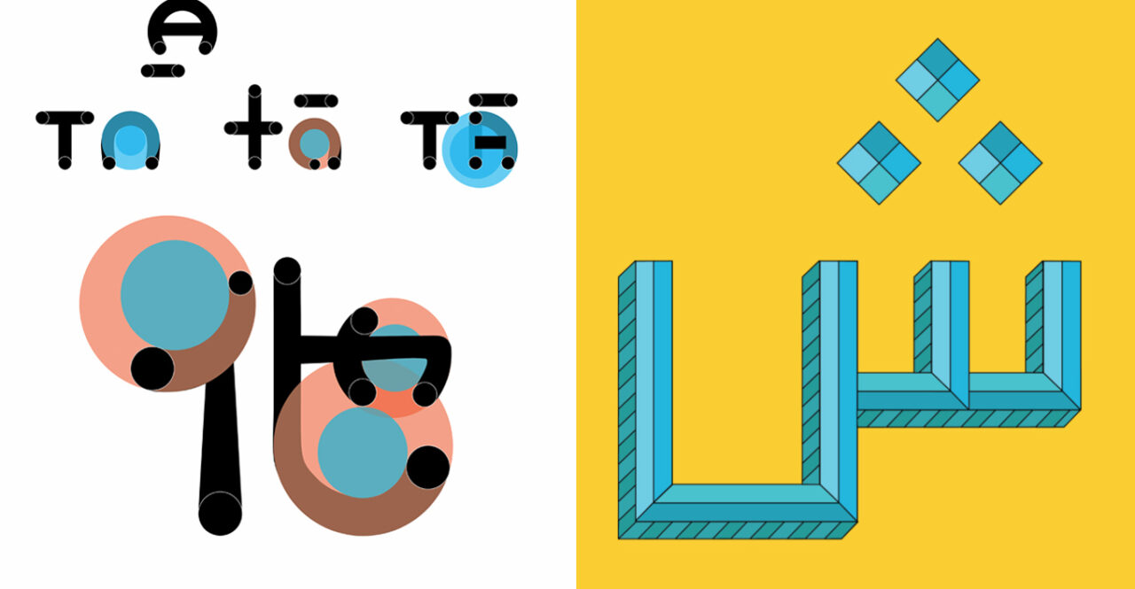
Collaborative Type Design Project. Left: Clara Ngie, Chase Hansen, Aily Nishioka, Yvonne Zhao. Right: Yasmin Bakhtiari-zadeh, Zara Imran Hassan, Austin Neufeld. (Photo courtesy the designers)
These group sessions were established explicitly as “safe spaces for experimentation,” she says — an environment defined by openness, respect and a willingness to learn.
“There were lots of opportunities for empathy, and for understanding someone else’s perspective through these assignments and activities that we were doing around typography.”
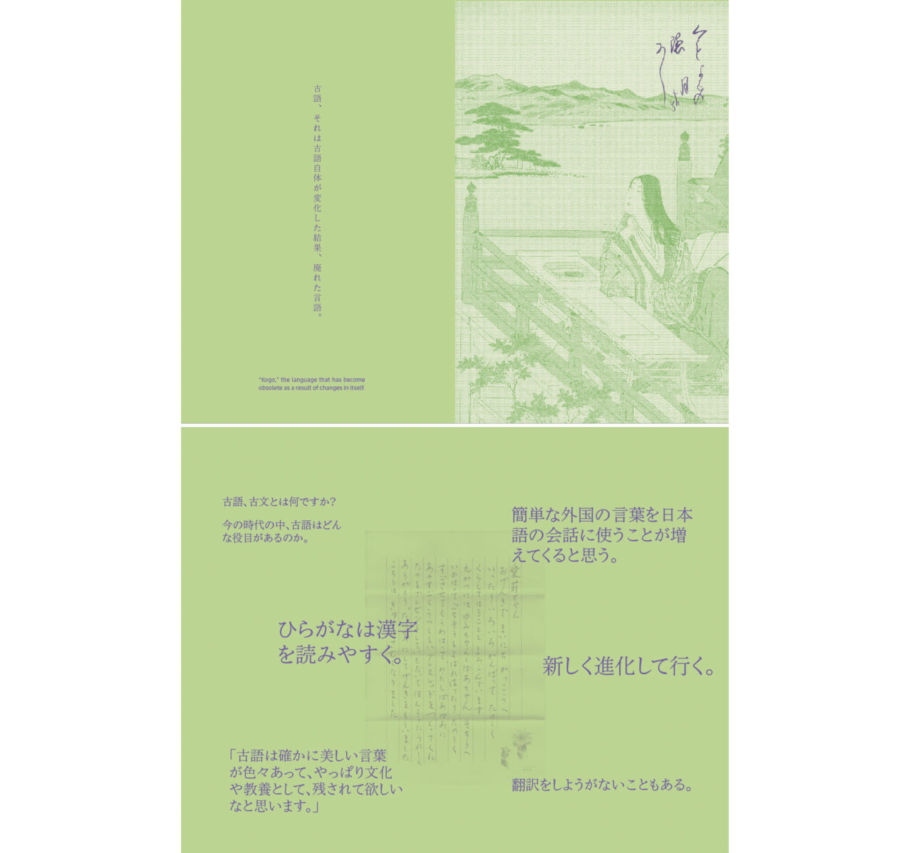
The learning curve is not only interpersonal. There are real formal challenges that embody the broader political and social concerns behind the practice of bi-scriptural typography. For example, designing a poster that contains both Arabic and English letters isn’t as simple as ensuring both fonts are sized equally. The English alphabet appears linear and condensed compared to the more sinuous, organic lines of the Arabic alphabet, Reyhan observes.
This leaves the designer with some tough decisions regarding how to establish visual harmony. But the relationship between English and Arabic alphabets also has a specific sociocultural history. This sociocultural history will have important local nuances, depending on where a designer is located. So, how can a balance be struck between the internal, aesthetic needs of the poster as a visual composition, and an acknowledgment of the sociocultural context in which the poster is being created?
Developing tools, workflows and clear guidelines for doing just that is what Reyhan and her students set out to do. Along the way, they produced a stunning array of smart, gorgeous, innovative typography work.
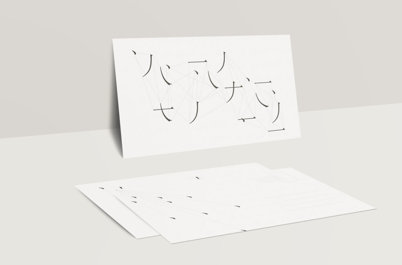
Postcard design by design student Yvonne Zhao. (Photo courtesy Yvonne Zhao)
Partly, Reyhan believes this is because students worked from a place “cleared of abstractions.” Not only did they get the chance to chart concrete steps for responsible collaboration, they also got a crash course in what not to do.
“We studied examples of typographies that were very much based on stereotypes, or based on someone’s five-minute online study of a culture,” Reyhan recounts.
“We spent time looking at them through the lens of a native speaker to see how ridiculous they look; how completely wrong and unrelatable. These studies were meant to support the understanding of the possible traps we can fall into if we don’t understand a language and we are not committing to the work.”
Collaboration across cultures and across language abilities, she adds, is one possible way such traps can be avoided. Especially when that collaboration is founded on a clear understanding of what a designer’s responsibility is when approaching another culture, and what a designer can expect from native-speaker friends, colleagues or fellow designers.
Decolonization, inclusivity and accessibility get talked about a lot these days, she says. But too often, they’re spoken of as ideals, or in general terms, stopping short of unpacking what those ideals stand for in an applied context. In part, Reyhan notes, this is because getting specific about that “applied context” is the work. This is why a practice as seemingly granular as typography can have such a grand impact; a font is never simply a way to describe an alphabet. It’s an entry point to a language, a culture, a world. And it’s in such spaces that the work of decolonization can meaningfully begin.
“If we’re not giving ourselves and our students a safe
learning space to actively experiment — to see how things might actually
look — then commitments to ideals are merely statements on a piece of
paper,” she says. “They remain abstract, far from the reality of our
everyday lives.”
Publication design by design student Aily Nishioka. (Photo courtesy Aily Nishioka)
Reyhan notes her work on bi-scriptural typography has been deeply informed by conversations with ECU community members including Celeste Martin, Katherine Gillieson, Jon Hannan and Justin Langlois. Her course on the subject was conducted with the help of teaching assistant and ECU MDes student Meghna Mitra. Learn more about Reyhan’s work, including her workshops, exhibitions, publications and objects, on her website.