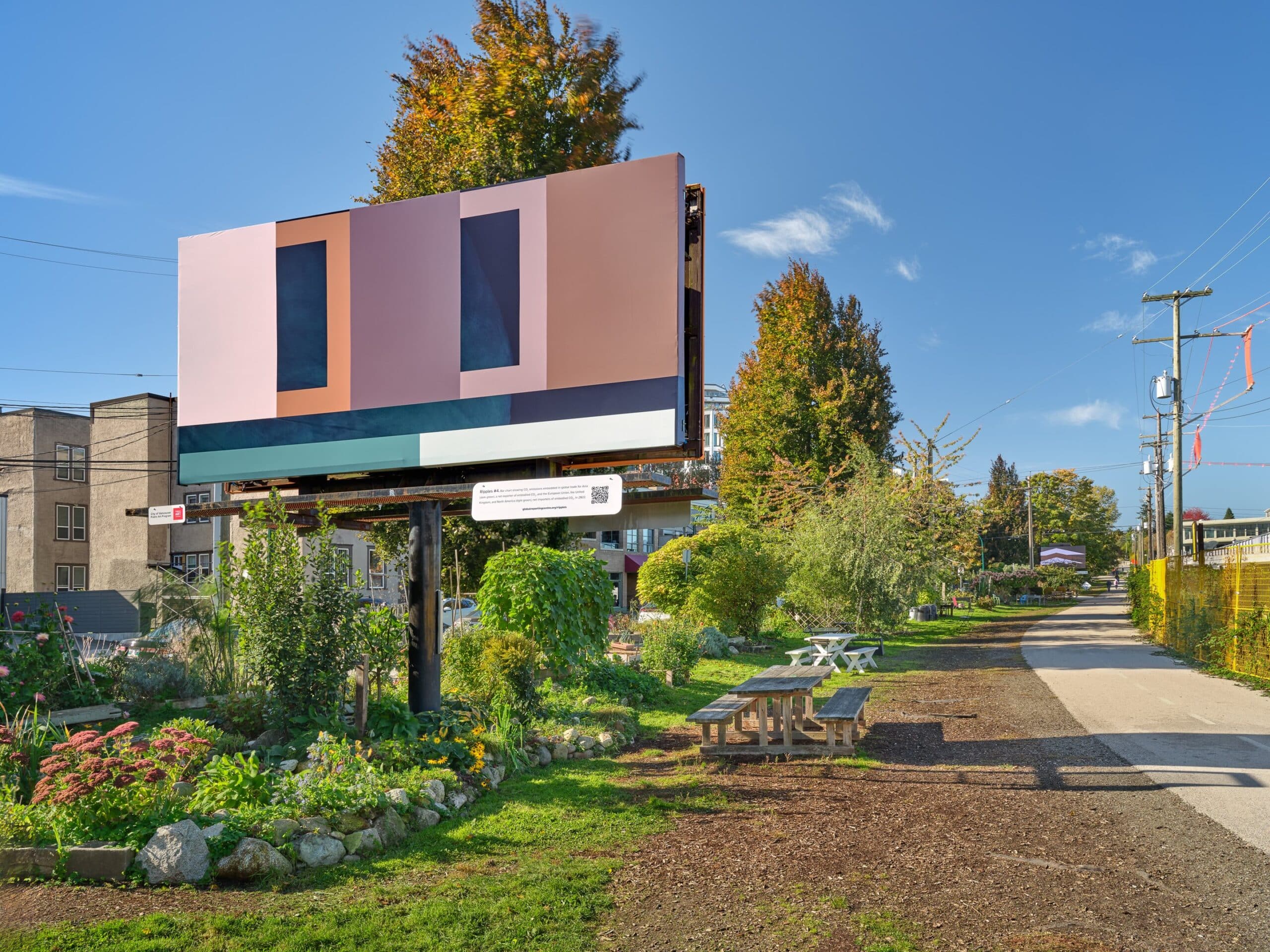
Developed in collaboration with researchers in BC and Halifax, Ripples comprises nine artworks which probe the intersection between data visualization, information and abstraction.
A new public art project from artist and Emily Carr University of Art + Design (ECU) faculty member Sydney Hart examines how data related to the hidden impacts of global trade is visualized and understood.
Through a series of images combining data visualization, satellite imagery and abstract geometric shapes, Ripples explores new ways of giving shape to the staggering economic, social and environmental effects of global supply chains.
“If we look at the terminology you often see in statistics, like ‘per capita,’ it can be head-scratching and hard to see how it plays out in everyday life,” Sydney says. “So, I was interested in how these kinds of things can be translated through art. How can you express being overwhelmed by statistics? And how can we make this type of data visualization accessible?”
Ripples is a collaboration with artist, curator and University of British Columbia (UBC) Bachelor of Media Studies chair Christine D’Onofrio, researcher and St. Mary’s University faculty member Gavin Fridell and the Global Reporting Centre (GRC) at UBC.
The project is part of a seven-year, SSHRC-funded research and reporting collaboration called Hidden Costs of Global Supply Chains led by the GRC and involving dozens of academics, journalists and artists from around the world.
Ripples aligns squarely with Sydney’s work as both an artist and educator. His practice explores artistic approaches to data visualization, while at ECU he teaches in the Faculty of Culture + Community which encourages creativity within real-world settings and through cultural, environmental and social practices involving internal and external collaborations.
Through conversations with Christine and Gavin, Sydney developed nine images, five of which are installed through Nov. 23 on billboards along the Arbutus Greenway in Vancouver.
With recent figures estimating that trade accounts for roughly a quarter of total global emissions, Sydney notes that a deeper public understanding of the sector’s ecological impacts is crucial for the increasingly urgent conversation around climate change.
“This project entailed a deep dive into economic questions I hadn’t seen addressed much in contemporary art,” he says. “So, it felt like an opportunity to surface things that haven’t been talked about before. And there are artists who do great work around pipelines or fossil fuels, but I wanted to move beyond addressing them through representation — to think about these issues in ways that don’t simply try to raise awareness or communicate statistics but play with how information is given form.”
For Sydney, this involved examining the intersection between data, information and abstraction. He developed a visual language of geometric forms to give shape to data, combining them with colours and satellite imagery to provoke new kinds of dialogue around these enormous topics.
“These statistics have a global, transnational dimension, and are diffuse and hard to pinpoint. So, one of my strategies was to look at simple comparisons,” he says, pointing to Ripples #5, which features three triangles of different sizes, each representing the per-capita consumption-based emissions of the US, Canada or Mexico. “Throughout the series, I played with similar comparisons that could be understood at a glance.”
During a guided tour of the public artworks in October, Sydney says the feedback he received suggested his artistic strategies allowed viewers to make unexpected connections, which traditional data visualization might have precluded.
“One friend interpreted an orange band as symbolizing the way they go about their daily activities while, in the background, the climate emergency remains largely invisible,” he says.
“That really resonated with how I was thinking about the series. I think many of us are familiar with this experience of having to make moral choices surrounding climate change, like having to sideline a catastrophe somewhere in the world just to meet our daily needs. And while I wanted information to be accessible to a broad public, I also wanted to express how some information is ignored or put on the back burner.”
Sydney will appear at ECU on Nov. 20 for a public panel discussion about the project with Christine D’Onofrio and Jaleh Mansoor, art historian and UBC faculty member.
Learn more about Ripples and Hidden Costs of Global Supply Chains now via the GRC’s website.
Visit Sydney’s website to learn more about his work.
The Faculty of Culture + Community offers a range of dynamic and interdisciplinary courses that provide the academic core and studio foundation to all three undergraduate degrees at ECU.
Through collaborations with partners including public, non-profit and industry organizations, students learn to understand creativity in cultural, environmental and social practice.
Visit ECU’s website to learn more.