Embrace the Mistake | Fraser Muggeridge
Posted on | Updated
An introduction to the work of our current Audain Distinguished Artist in Residence.
How do you approach graphic design when the influx of ready-made software makes everyone a designer? How do you combat the blanket of blandness that has allowed graphic design to become commonplace in popular culture? These are questions that type designer Fraser Muggeridge not only addresses in his practice, but successfully tackles in his transformation and study of culturally saturated typefaces, such as Helvetica.
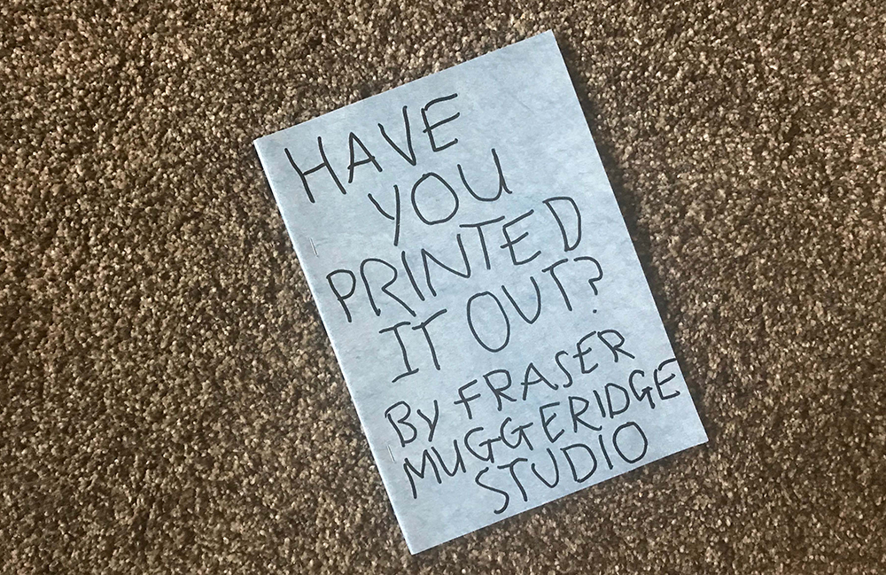
Our current Audain Distinguished Artist in Residence, Fraser has an uncanny ability to challenge the current production and processes involved in typesetting and printing. The manipulation of current technology by utilizing it “wrong” has provided Fraser with unique methodologies to breathe new life in to the everyday. His regular daily study of typefaces have been collected and bound into an artist book, Have you printed it out? which will launch at the 2018 Vancouver Art Book Fair. Fraser shared a deep and technical insight into his process with type during his Artists’ Talk on October 9 at the Reliance Theatre.
During his artist talk, Fraser discussed the early stages of his practice and the history of typographical design, referencing cult favourites such as Fudoni and Beowolf that began the wave of typeface manipulation. Fudoni, designed by Max Kisman in 1991, is a lurid combination of Bodoni and Futura. Beowolf, designed by Just van Rossum and Erik van Blokland at the end of the 1980s was distinctly ahead of its time with the seemingly infinite possibilities of randomness when printed.
Both of these iconic typeface manipulations are a prelude to Fraser's Mega Font, created in 2013 as a reaction to the sheer volume of san serif fonts being produced were already so similar. For Mega Font, Fraser used 52 different typefaces, one for each uppercase and lowercase character, and all with a similar grotesque. “Why choose one when you can choose them all?” Fraser joked during his talk.
Mega Font was made for a publication by David Berridge titled MAN AARG!, which is described by Fraser as a “jumbled exercise in reading about writing and writing about reading.” Aligning each character to the x-height gave the typeface a level of evenness but also created an uncomfortable tension as the differences in weight, character height, ascenders and descenders remain.
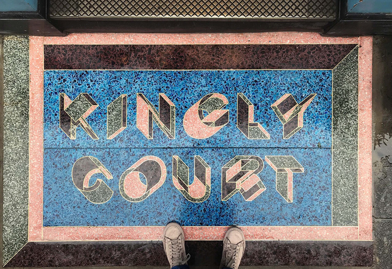
In one of many exercises in typeface design, Fraser experimented with 3D extrusions of Helvetica from different points on the x- and y- axis that could be applied to physical manifestations. These generated letterforms are a study in legibility versus illegibility, something that interests Fraser quite a bit. “It’s important for me not to change the automatic outcome of this systematic approach to design,” says Fraser. Instead, he evaluates it through an aesthetic lens after it has been generated. This particular study is embedded in the terrazzo of the small Kingly Court shopping district in London.
With typography being at the heart of Fraser's practice, it is no surprise that he is acutely aware of the aesthetic and emotional impact typefaces convey. Contemporary typeface design has reached an apex of technology and quality: there's a surplus of choice, each exhibiting machine-like perfection. “But why do I struggle to use these new fonts?” Fraser asked during his talk. The answer seems to lie in the fact they lack any idiosyncrasies that come with traditional typesetting. Using them is simply too easy and removes the hand of the graphic designer.
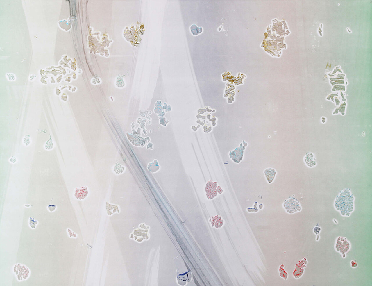
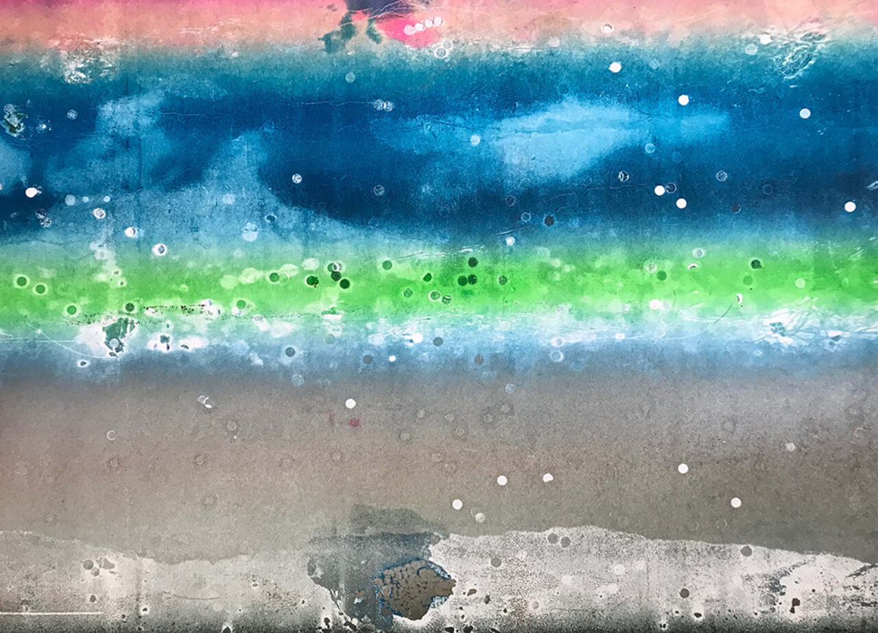
It is not only the perfection of typefaces that Fraser looks to remix, but using the processes of print production as a medium as well. “It uses the knowledge, technical possibilities, and constraints of offset lithography printing as a creative tool,” shares Fraser. It is an exercise in randomness, chance, and design by accident brings back some uniqueness to design. By pushing and playing with the current parameters of offset printing, he is able to create unique works of art on a machine designed to produce perfect copies.
While in Vancouver, Fraser is working with Ryan Smith, ECU student and owner of Brick Press, to continue his experiments with offset printing. The detail above was achieved by utilizing the cut outs left over from hole-punching to enable the plates to be fixed to the press. “These dots are normally discarded, but we put them back into the press,” explains Fraser. These processes allow Fraser to create a piece of art without any visual material to begin with. Some of the other disruptions to the printing process he utilizes are the skins from ink, spraying water or gasoline onto the press while it’s rolling, and inserting torn black paper which acts as its own plate.
Fraser's studio work balances between avant-garde design and contemporary art. His consistent challenging of the current boundaries within design and art have produced unique interruptions to the blandness of design we are surrounded with daily.