Led by the Shumka Centre for Creative Entrepreneurship, the program pairs students with experienced practitioners from across Canada.
A new pilot initiative at Emily Carr University of Art + Design (ECU) provides one-on-one mentorship opportunities for students as they approach graduation.
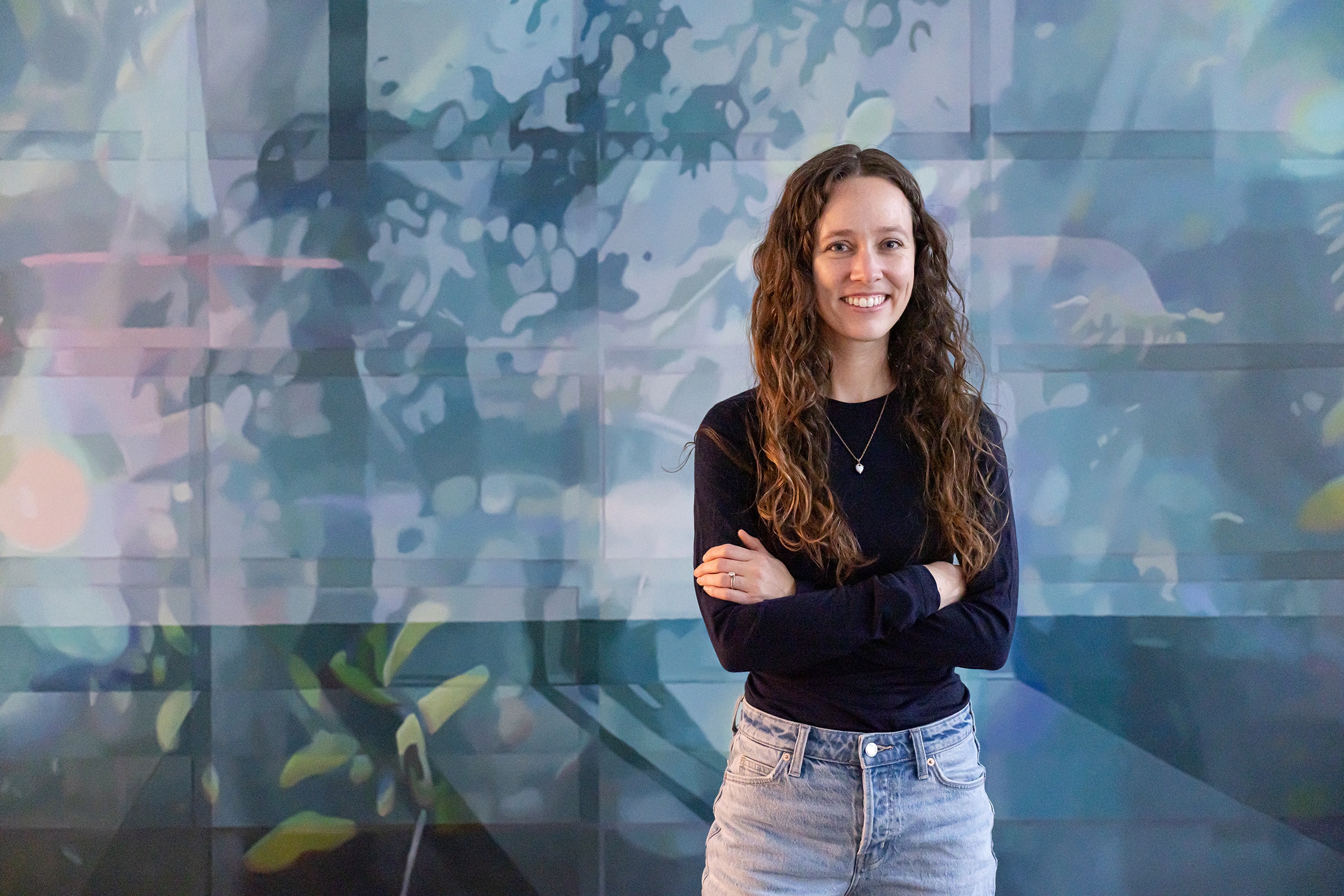
Low-Residency Master of Fine Arts student Emilie Fantuz (MFA 2026) says the Mentorship-in-Residence (MIR) program helped her clarify next steps as she prepares to enter her career as a professional artist.
“I’m graduating this year, and while I have a few things set up for 2027, I’m starting to brainstorm what might come next. My work has evolved and developed during my time at ECU, so where could there be opportunities to show my work? Where might I fit into the art world?” says Emilie, who spoke with mentor, curator and creative entrepreneur Craig D’Arville.
“Speaking with Craig was immediately comfortable. He’d read about my practice, and we talked through my questions from his perspective as someone who’s made a career outside Vancouver. He was knowledgeable, easy to talk to, prepared and practical. I feel lucky to have connected with him.”
Led by the Shumka Centre for Creative Entrepreneurship, the MIR program offers short, focused mentorship sessions with one of 19 experienced practitioners from design, arts and creative-economy infrastructures across Canada. Mentors provide a real-world perspective on topics such as professional pathways, capstone and applied research reviews, portfolio and project positioning, and share lived experiences on how to sustain a creative practice, collaboration and next steps after graduation.
MIR is part of Pathways for Creative Futures: Entrepreneurship Pathways, a programming series that equips emerging practitioners with structured opportunities to test ideas with real partners, audiences and markets, gain professional insights, and build clearer employment and self-employment pathways.
Entrepreneurship Pathways is funded in partnership with the Business + Higher Education Roundtable and with support from the Government of Canada.
Mentor Coco Faiz is a UX research expert, consultant and senior UX researcher with Adobe. Having benefited personally from mentorship in the past, she says becoming a mentor herself in recent years felt like a natural fit.
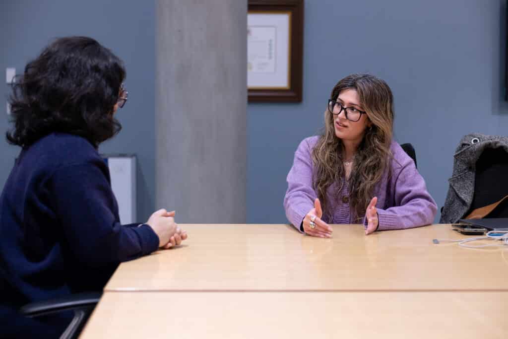
“My mentors really shaped my journey from the very beginning,” she says. “From moments when I was vulnerable or uncertain to moments where I was happy and achieving things, mentors have been a huge part of my life. I’m now at a stage where I can give back, and it feels like the right thing to do.”
She notes that questions and anxieties about life after graduation are nearly ubiquitous among emerging practitioners. But those concerns take a unique shape for each new cohort.
“For that reason, it’s important for me to understand their specific context and support them accordingly. There is no one-size-fits-all guidance. I think many mentors miss that,” she says.
“The hardest part for anybody is understanding what they truly want. But most of the ECU students I spoke with understood that already, which was amazing. So, my goal with each interaction was to help my mentee find a direction for moving forward or a roadmap for next steps.”
Emilie, who grew up in Michigan and made a previous cross-continent move to Hawaii, says the program offered a vital complement to the Low-Residency MFA program.
“A great part about the Low Residency program is meeting so many people from across Canada and beyond — diverse people from very different environments,” she says.
“I think it’s really important to connect with as many people as possible, and that’s what makes the MIR program so enriching as well — speaking individually with somebody helps build a relationship, talk over questions and get insights.”
In addition to her recent two-person show, Liminal City, at Pendulum Gallery in Vancouver, Emilie is headed to Newfoundland in August for a six-week residency with the Art in the Parks Artist-in-Residence program at Terra Nova National Park. The work she creates during her residency will be exhibited in 2027 in a solo show at Christina Parker Gallery in St. John’s, NL.
More About the Low-Residency Master of Fine Arts Program at ECU
ECU’s two-year low-residency MFA degree offers a flexible structure designed for working artists, creative practitioners and educators.
Combining immersive on-campus residencies with synchronous online coursework, the program supports sustained creative growth within your own community and studio context.
Visit our website to learn more.
Want more stories like this one delivered twice a month to your inbox?
Subscribe to our free Emix newsletter today!