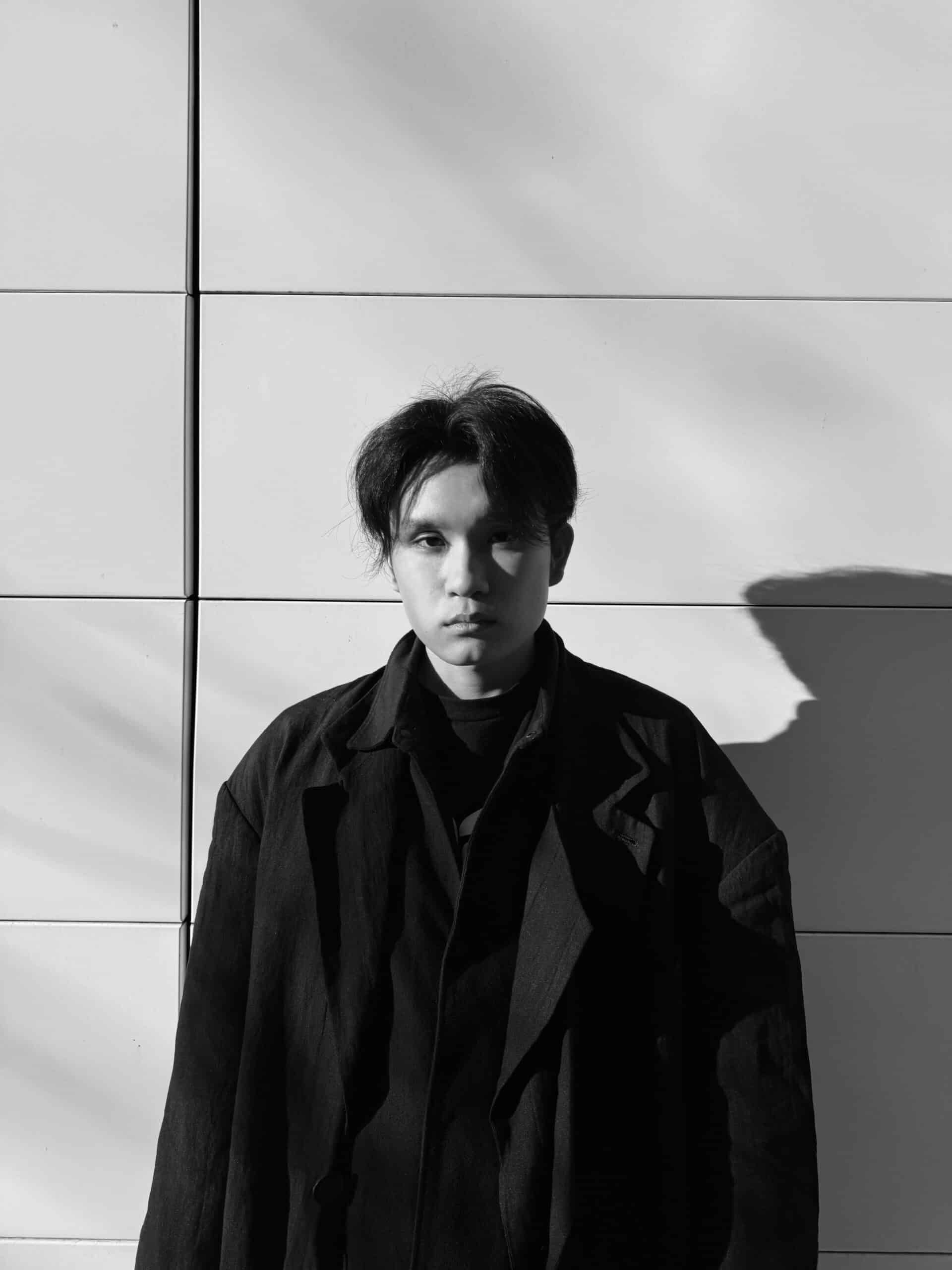
For alum Tiger Peng, showcasing their debut collection at London Fashion Week and developing their design practice, carries forward the lessons from their Industrial Design education at ECU.
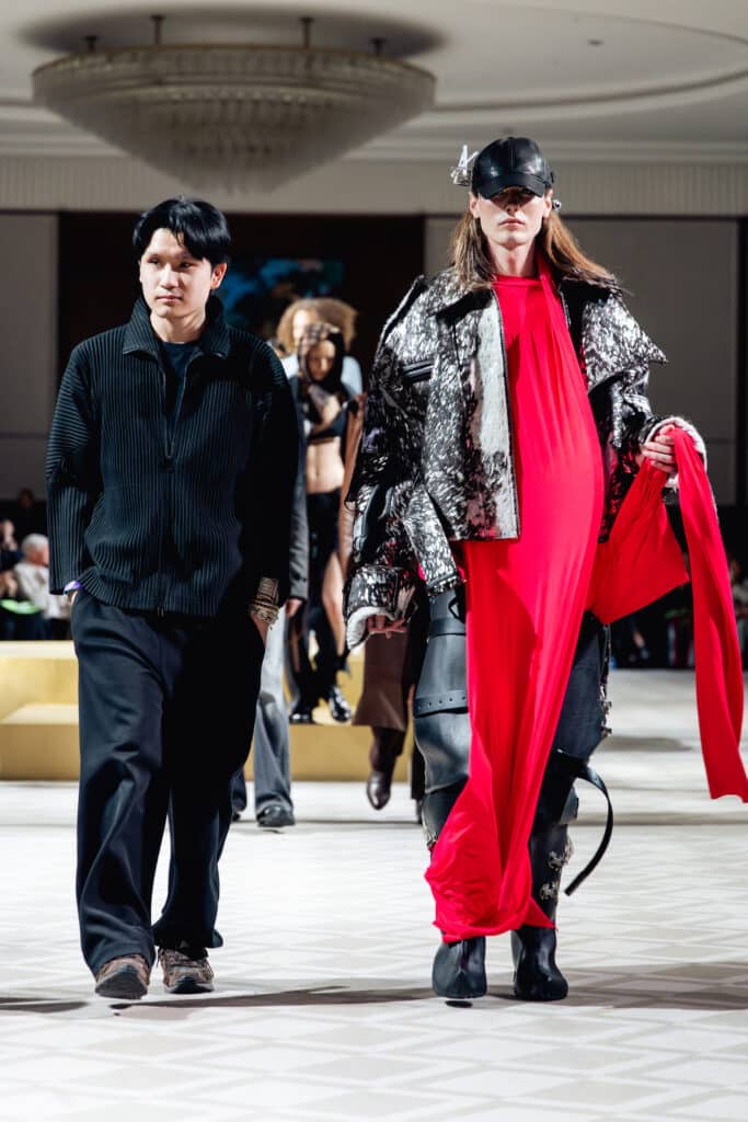
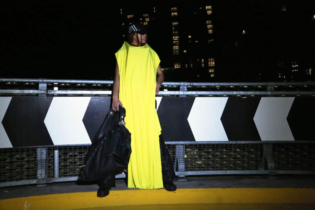
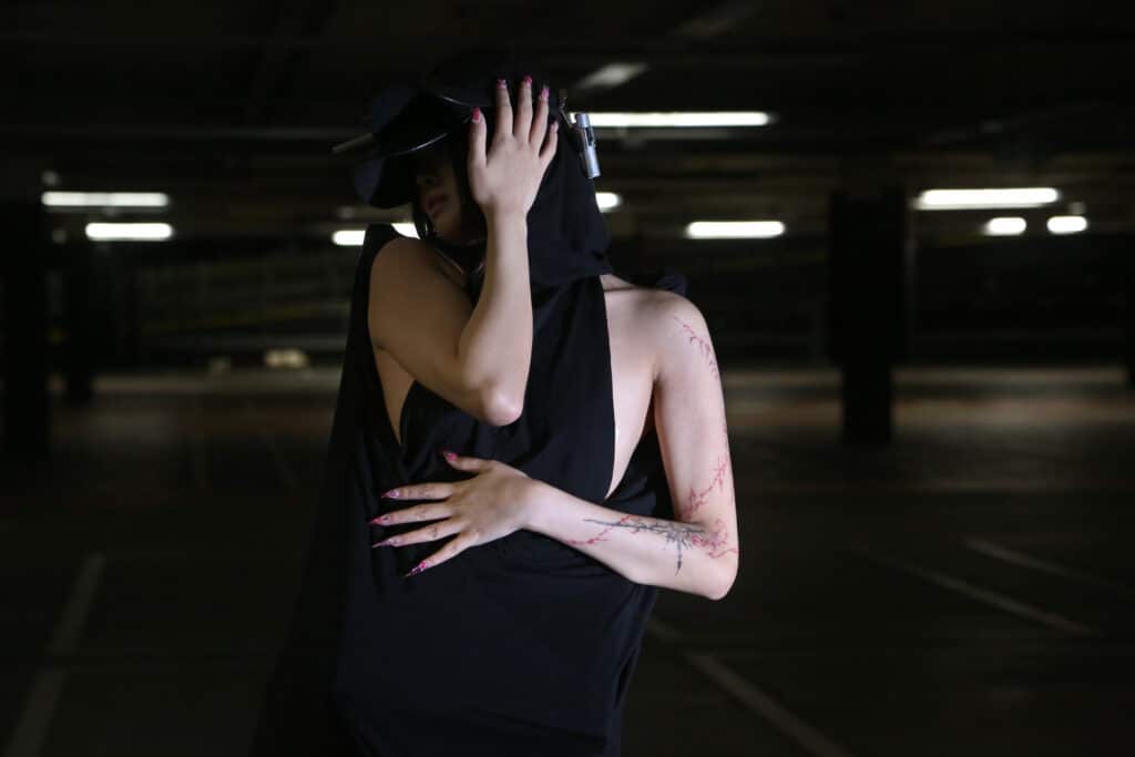
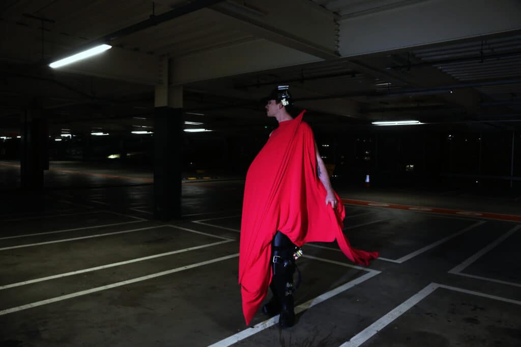
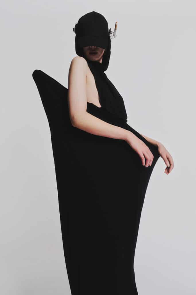
Tiger Peng (BDes, 2023) knew right away that their debut collection ‘Private Ensemble’ had to meld storytelling, movement and structural design. Their collection, presented during London Fashion Week at the London College of Fashion (LCF), where Tiger currently studies, explored the physical transformations that happen within nightlife spaces.
“My collection was inspired by queer dancing bodies under fracturing lights and how that body transforms in crystallizations under strobe lights and in club environments,” Tiger says. “A key aspect of my process was utilizing movement research”
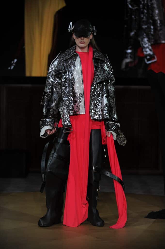
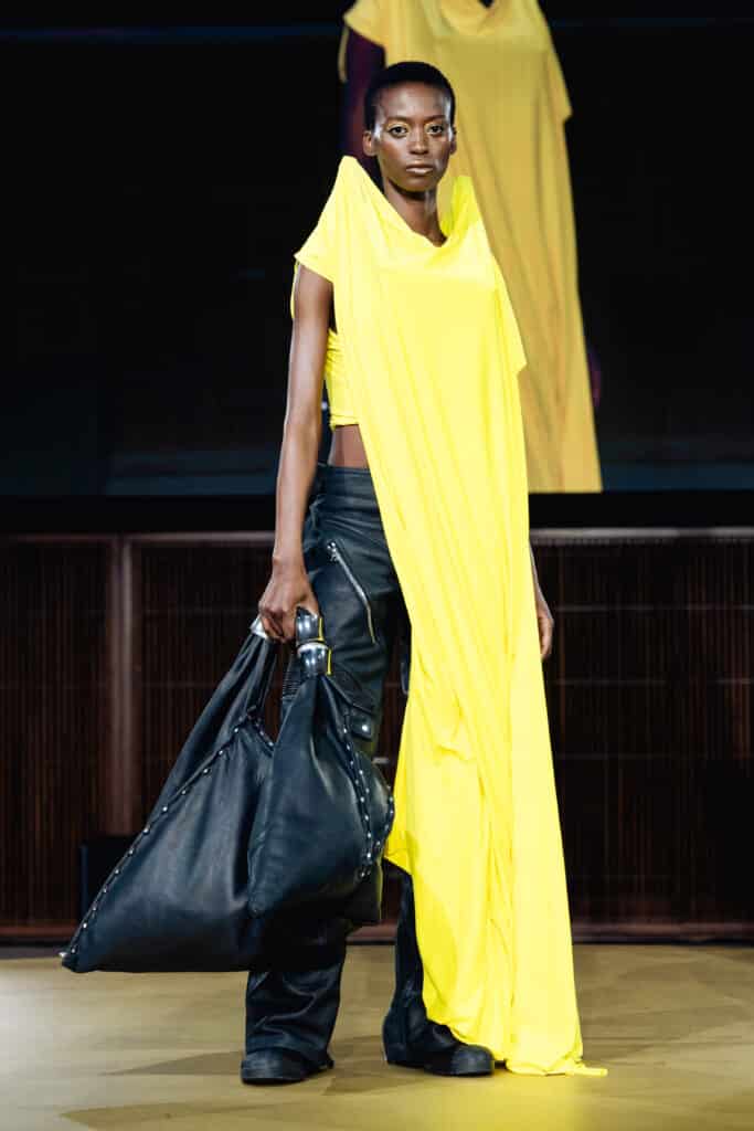
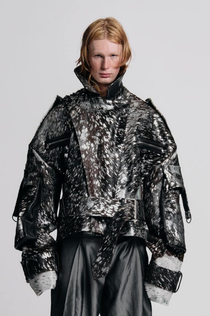
Shaped by nights spent in the clubs of Hackney in London’s East End, the collection rejected conventional garment-making methods in favour of experimentation and structural design. Eschewing mannequins and conventional garment-making techniques, Private Ensemble features wooden structures extending from dresses, tops and a statement leather jacket with a hometown connection: Vancouver’s Lonsdale Leather.
“It brought a piece of home into my work, and that piece was informed by a moment after a night of clubbing and stepping into the morning with rain hitting overheated skin,” Tiger said. “The colours were also drawn from strobe lighting, club environments and nocturnal atmospheres. It is all about protecting your idea and the integrity of the story and not allowing it to be diluted.”
Industrial Design as a Fashion Lens
While the collection emerged from London’s nightlife scene, Tiger traces much of their interdisciplinary approach to fashion design back to their time at Emily Carr University of Art + Design (ECU). In Hélène Day Fraser’s classes, experimentation across forms and materials became central to storytelling.
“In my third year core studio class, I asked students to think about the narratives attached to clothing and the storytelling that’s related to it, and equally what it means to create clothing that is aware and responsive to the ecological crisis that we’re in,” says Hélène. “Faced with raw wool that still needed to be cleaned and carded, Tiger’s group approached this prompt in the best of ways. Rather than creating a conventional textile product made of wool, they developed a system of moulding plant pots out of beeswax and raw wool.”
Charting the off-beaten path is something Hélène recognized early in Tiger’s work and their other projects during the program were equally experimental and played with a diverse array of forms and materials.
“Tiger was always inclined to take on projects in a different way. The cool thing about what’s happening at Emily Carr University in terms of our Industrial Design program is that we have a steady flow of students who are taking on projects connected to textiles and clothing, and they do it in a way that is notably different from students in conventional fashion programs. With their experience in 3D modelling and printing gained here, Tiger had experience and a skillset that many people he was competing with at LCF did not.”
Integrating found materials and structural pieces in Hélène’s courses allowed Tiger to choose fashion as the vehicle to highlight their storytelling and perspectives on the body and movement.
“I was always keen on pursuing fashion, but that course and through handling materials like wool, I was given the clarity and confidence to fully commit to the medium,” said Tiger. “It was the first time I actually felt I was bringing life into a fabric and that realization resonated with me.”
The Future of Fashion
In Tiger’s most recent education journey, the design process has been intensive but transformational. With their time at ECU providing the building blocks of their creative practice, studying at London College of Fashion allowed Tiger to tap into movement research and take creative risks.
“It feels like a full circle moment. It’s where I could synthesize everything I had learned into a single cohesive body of work, not only just experimenting, but honing in on a singular thing that I want to do,” said Tiger. “At LCF it was about capitalizing on my interdisciplinary abilities, which were drastically different from my peers.”
With Private Ensemble debuting at London Fashion Week, the collection encapsulates that daring spirit through garments that move between fashion and wearable sculpture. Creating those structural pieces posed challenges throughout the development process.
“It took some time to refine the angles and how they interact with movement ergonomically. But it’s also so different from traditional fashion practice!” said Tiger. “I vividly remember how to pad all the unsanded wood structures to each fitting until I got the construction angle correct. It was important that the collection wasn’t just visual but an extension of the body.”
Even with their roots planted in London’s fashion scene, Tiger is still grounded in the interdisciplinary mindset from ECU. From early experiments in 3D printing to learning garment-making, Tiger is expanding what fashion can be through their approach, which they encourage future students to nurture.
“Take a more expansive view of what fashion is because as a design student, you are in a unique position to experiment across materials and disciplines. Design must be rooted in intent, purpose, and story,” said Tiger. “If you want to pursue this path: be ambitious, protect your direction and always ground your work in research.”